Creating the Personal Network
Developing a distinctive brand identity for a revolutionary personal networking platform that puts data ownership back in users' hands. The design solution combines geometric connectivity with warm gradients to reflect both technical sophistication and human connection, setting the foundation for us.relate's vision of secure, user-controlled networking.
us.relate Brand Design Case Study:
Project Overview
us.relate emerged from a vision to revolutionize personal data management and networking. Currently in early development, the project required developing a brand identity that would communicate trust, connection, and user empowerment while differentiating from traditional social media platforms.
Development Status
It's important to note that us.relate is currently in its early development phase, with no active product in the market. The brand identity work was conducted as a foundational element to establish a strong visual presence and communication strategy for the upcoming platform launch.
Client Challenge
The primary challenge was to create a visual identity that would:
Represent a complex technical solution in an approachable way
Communicate the core value of personal data ownership
Stand out in the crowded digital networking space
Build trust through design while maintaining sophistication
Strategic Approach
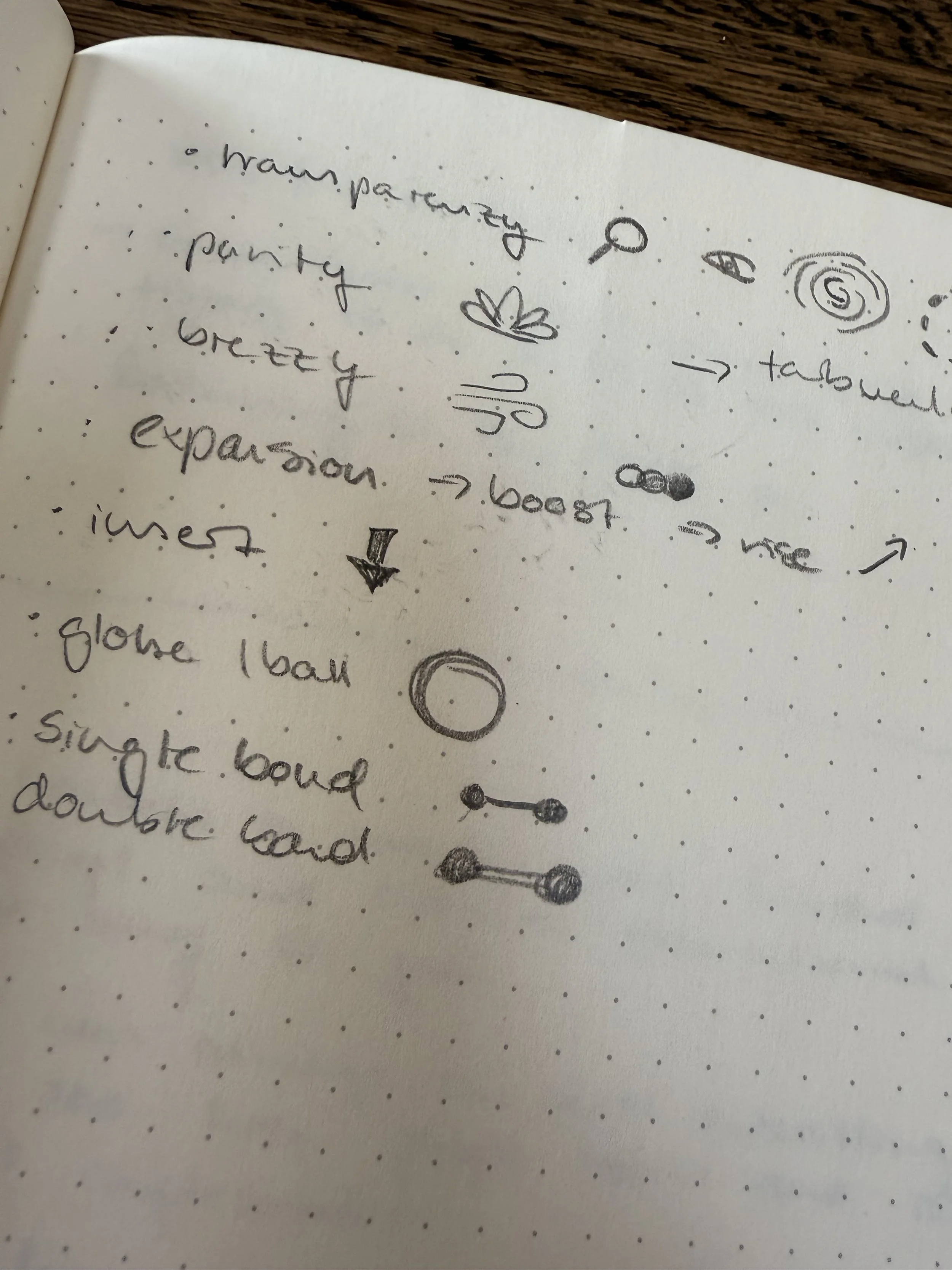
Initial Brainstorming
The design process began with an extensive brainstorming phase, exploring:
Various interpretations of "connection" and "networking"
Different visual metaphors for data ownership and privacy
Multiple approaches to representing personal relationships
Creative ways to incorporate the "us" concept into the design
The brainstorming sessions resulted in numerous sketches and conceptual explorations, which helped identify the most promising directions for the brand identity.
Design Development
Following the brainstorming phase, the process focused on exploring various visual representations of connection and data ownership. The final direction centered on interconnected geometric shapes that create a distinctive "us" monogram, symbolizing both the platform's name and its core purpose of connecting people.
Design Solution
Logo Development
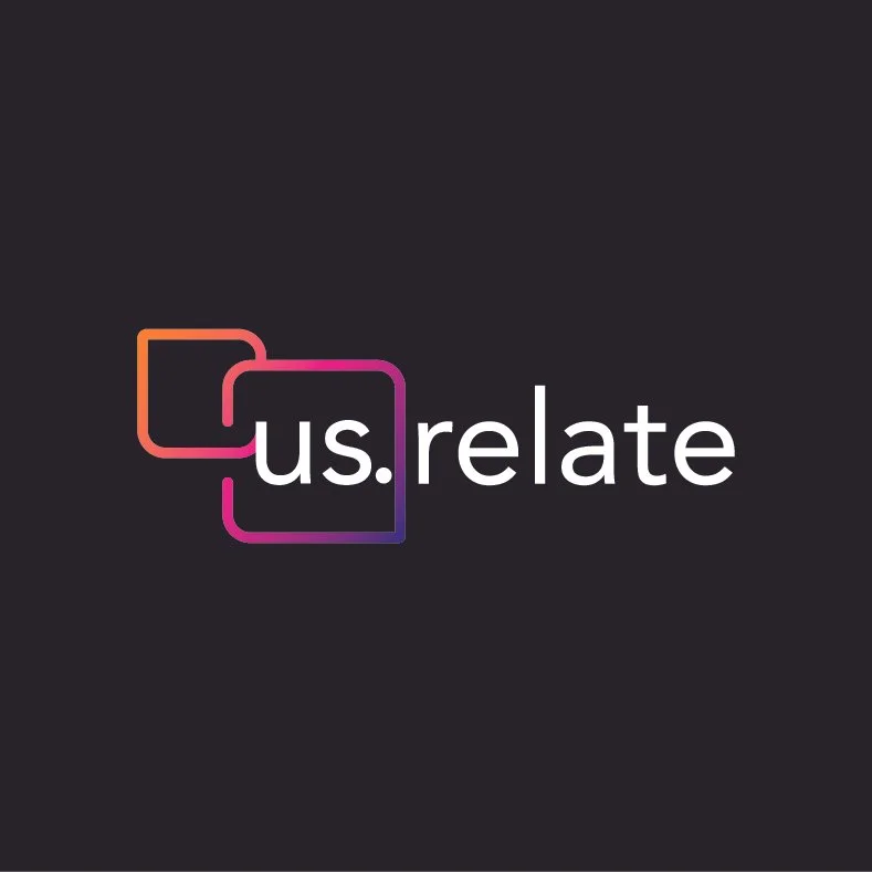
The journey began with exploratory sketches that investigated different ways to represent connection and relationships. The final logo emerged as an elegant solution featuring:
Overlapping squares creating a fluid, continuous form
A gradient from warm orange to vibrant pink, suggesting energy and approachability
Clean, modern typography with the distinctive "us.relate" wordmark
Intentional use of the period to separate "us" and "relate," emphasizing the platform's focus on personal connections
Color Strategy
The chosen color palette serves multiple purposes:
The gradient from orange to pink creates visual warmth and energy
Black backgrounds provide sophistication and emphasize security
White typography ensures clarity and readability
The overall combination positions the brand as both trustworthy and innovative
Typography
The typography choice reflects the brand's dual nature:
Modern, geometric letterforms align with the tech-forward nature of the product
Comfortable readability emphasizes the human-centric approach
Consistent spacing and alignment reinforce the brand's attention to detail
Visual Language
The brand's visual language emphasizes:
Geometric shapes that suggest interconnection
Clean, minimal design that reflects data organization
Thoughtful use of negative space to enhance clarity
A consistent grid system that reinforces the platform's structured approach
Results
The final brand identity successfully:
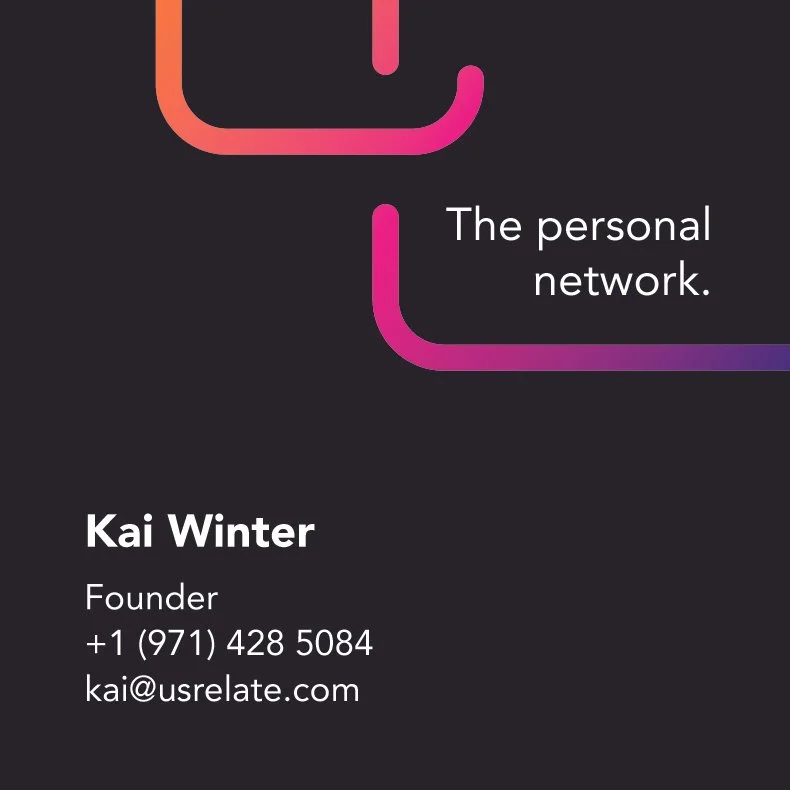
Communicates the core message of "The personal network" through visual metaphor
Creates a distinctive presence that stands out from traditional social media platforms
Balances technical sophistication with human approachability
Provides flexibility for various applications while maintaining consistent brand recognition
Key Deliverables
Primary logo with gradient treatment
Monochrome variations for different applications
Brand guidelines for consistent implementation
Business card design showcasing the brand system
Various logo iterations for different contexts and uses
Impact and Future Potential
While the platform is still in development, the brand design has established a strong foundation for us.relate's future launch. The identity system effectively communicates the platform's unique value proposition of personal data ownership and secure connections, positioning it as a trustworthy alternative to conventional networking platforms. This groundwork will be crucial for building brand recognition and user trust as the product moves toward launch and beyond.