A Digital Playground
This fictional branding project explores how design can bring the world of digital art to life. The goal was to create a visual identity for the German “Museum für digitale Kunst” (Museum of Digital Art), a conceptual space where creativity, technology, and user interaction come together.
Case Study: Branding for the “Museum für digitale Kunst”
Overview
The Museum of Digital Art is envisioned as an innovative space that celebrates interactive and immersive digital art.
This branding project aimed to create a cohesive visual identity that reflects the museum's core values: creativity, accessibility, and innovation.
Problem Statement
The challenge was to design a brand identity that:
Appeals to a diverse audience, including tech enthusiasts, families, and casual visitors.
Balances the museum's experimental and educational ethos.
Captures the intersection of art, technology, and community.
Research and Insights
Target Audience
Tech Enthusiasts: Individuals fascinated by the technical aspects of digital art.
Families: Visitors seeking engaging, educational, and interactive experiences.
Artists and Designers: Professionals exploring cutting-edge artistic techniques.
Key Themes
Interactivity and Playfulness: Encourage visitors to explore and interact with exhibits.
Transparency of Technology: Highlight the "behind-the-scenes" beauty of digital creation.
Global Appeal: Welcome an international audience with a universal design language.
Concept Development
Core Concept
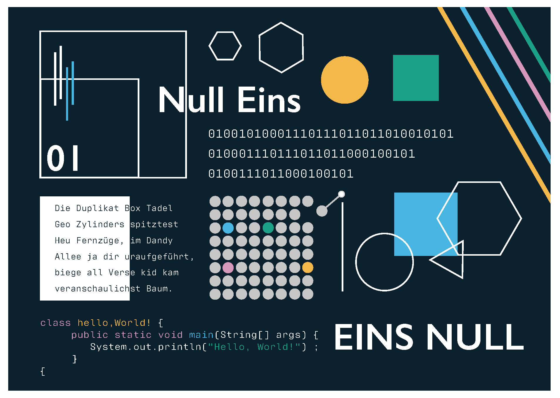
“Hidden Beauty” — The visual identity should reveal layers of meaning upon closer inspection, much like the museum's exhibits. This aligns with the philosophy of digital art as a blend of creativity and code.
Moodboard
Inspired by binary code, geometric shapes, and vibrant digital palettes.
A mix of dark tones with bright, energetic accent colors to evoke modernity and inclusivity.
Logo Exploration
Binary Code: A minimalistic logo combining the shapes of “1” and “0.”
Network Design: A web-like structure symbolizing connectivity.
Open House: A 3D representation of an inclusive space.
Sound Waves: Abstract soundwaves visualizing the spoken word “museum.”
Design Process
Sketches and Ideation
Hand-drawn iterations exploring abstract representations of digital art.
Refinement focused on simplicity and recognizability.
Color Palette
Primary Color: Deep blue (#0B202B) to convey professionalism and depth.
Accent Colors: Bright hues (#01A186, #4EB7E1, #F4B94B, #D697BB) symbolizing openness and diversity.
Typography
Wordmark Font: Gill Sans, chosen for its modern, versatile character.
Supporting Text: Antarctican Mono, echoing coding aesthetics.
Final Designs
Logo
A bold yet minimalist design inspired by binary code and the letter "M." The logo employs geometric shapes and vibrant accents to capture the museum’s dynamic spirit.
Business Cards
Clean layout featuring the tagline “Hello, World!” as a nod to programming culture.
A dark background with bright spotlights for contrast and emphasis.
Outcome
The final brand identity successfully communicates the museum’s mission to merge art and technology. The design invites audiences to explore and connect, reinforcing the museum’s reputation as a hub for creative innovation.